KD, 2025
Brand Identity
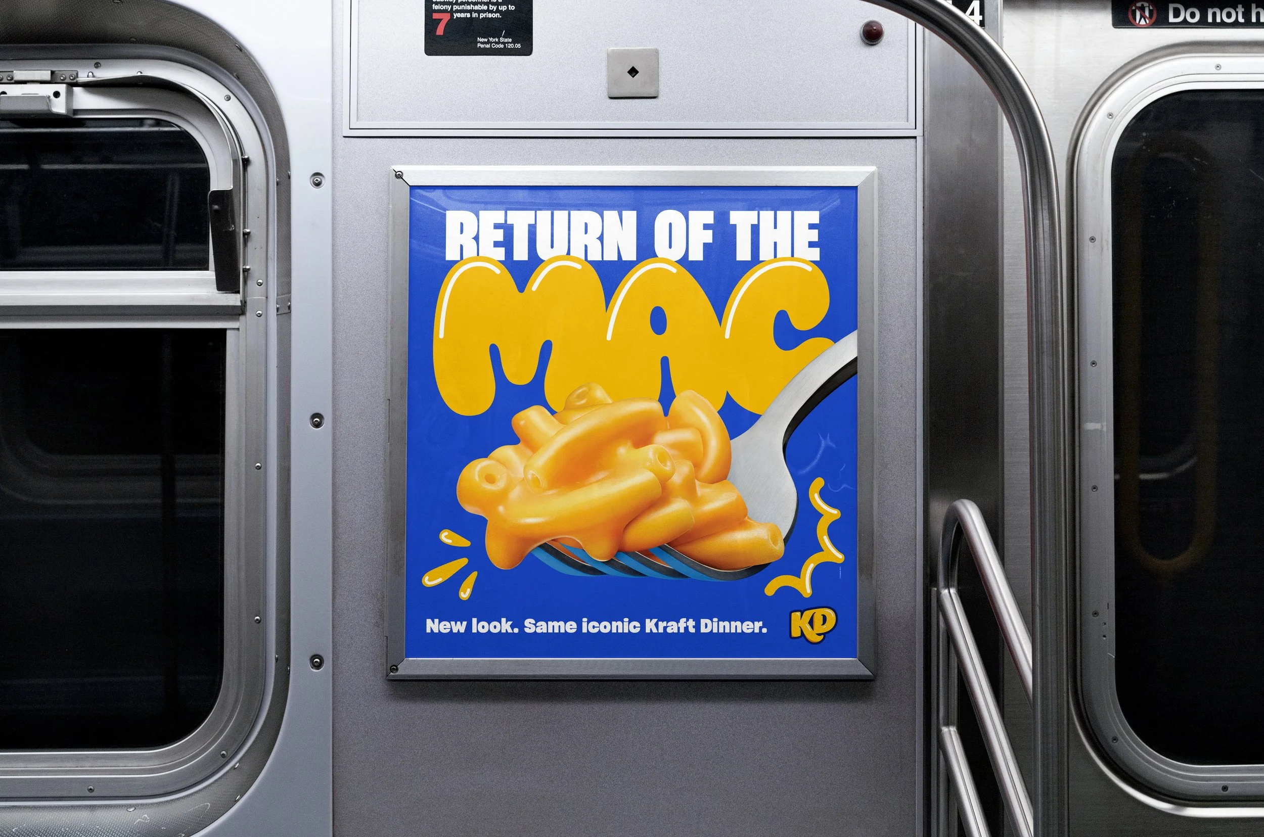
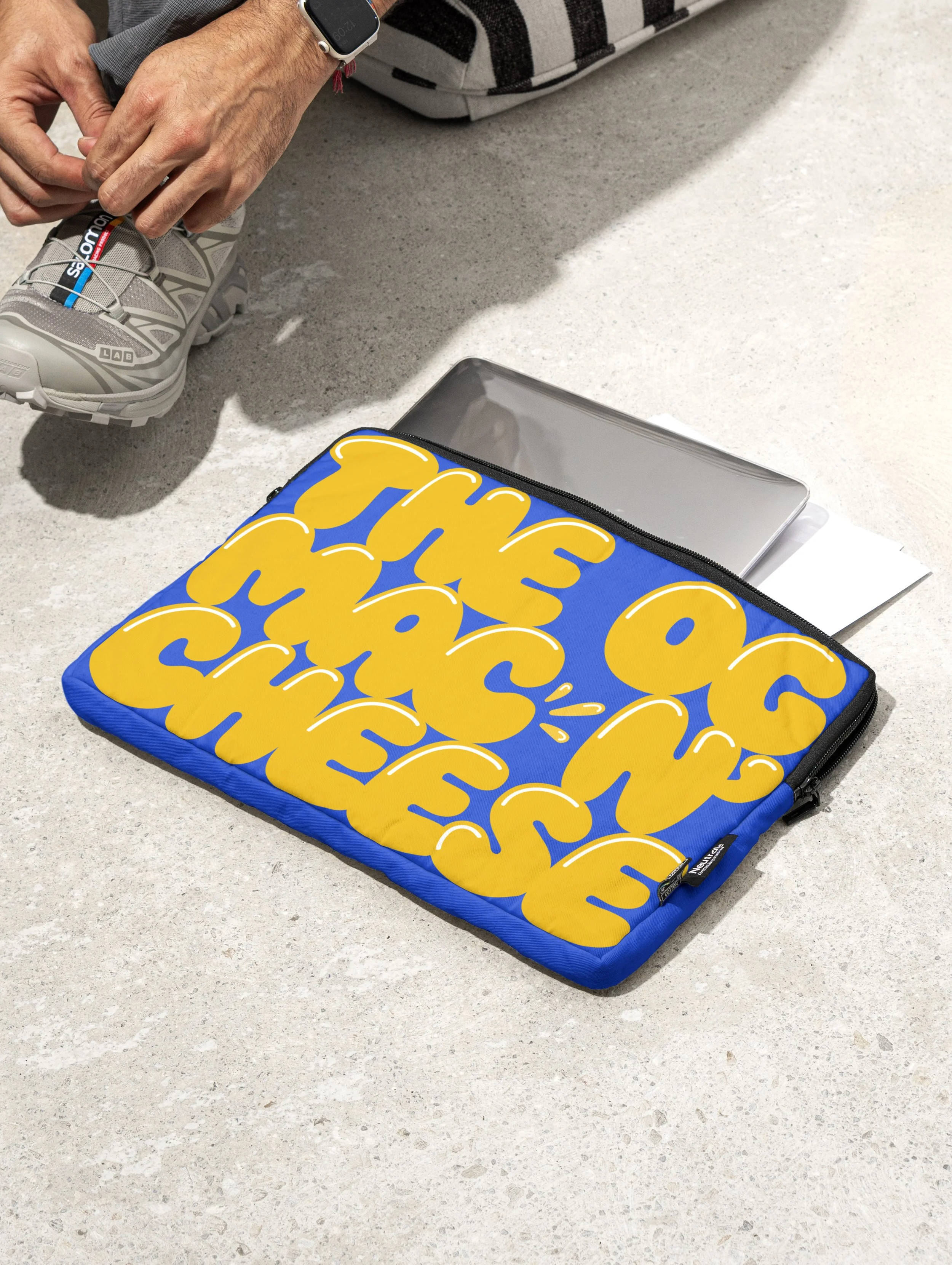
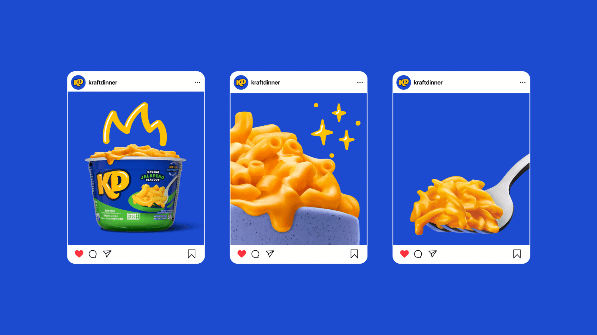
KD isn’t just another boxed mac and cheese brand. They're the original. But over time, they lost their edge. They weren’t fully leveraging their iconicity, and other of-the-moment convenience food brands were stealing attention from their legendary cheesy noodles.
To reclaim their spot and grab the attention of younger generations, we doubled down on what makes KD, KD and made something that feels unapologetically cheesy.
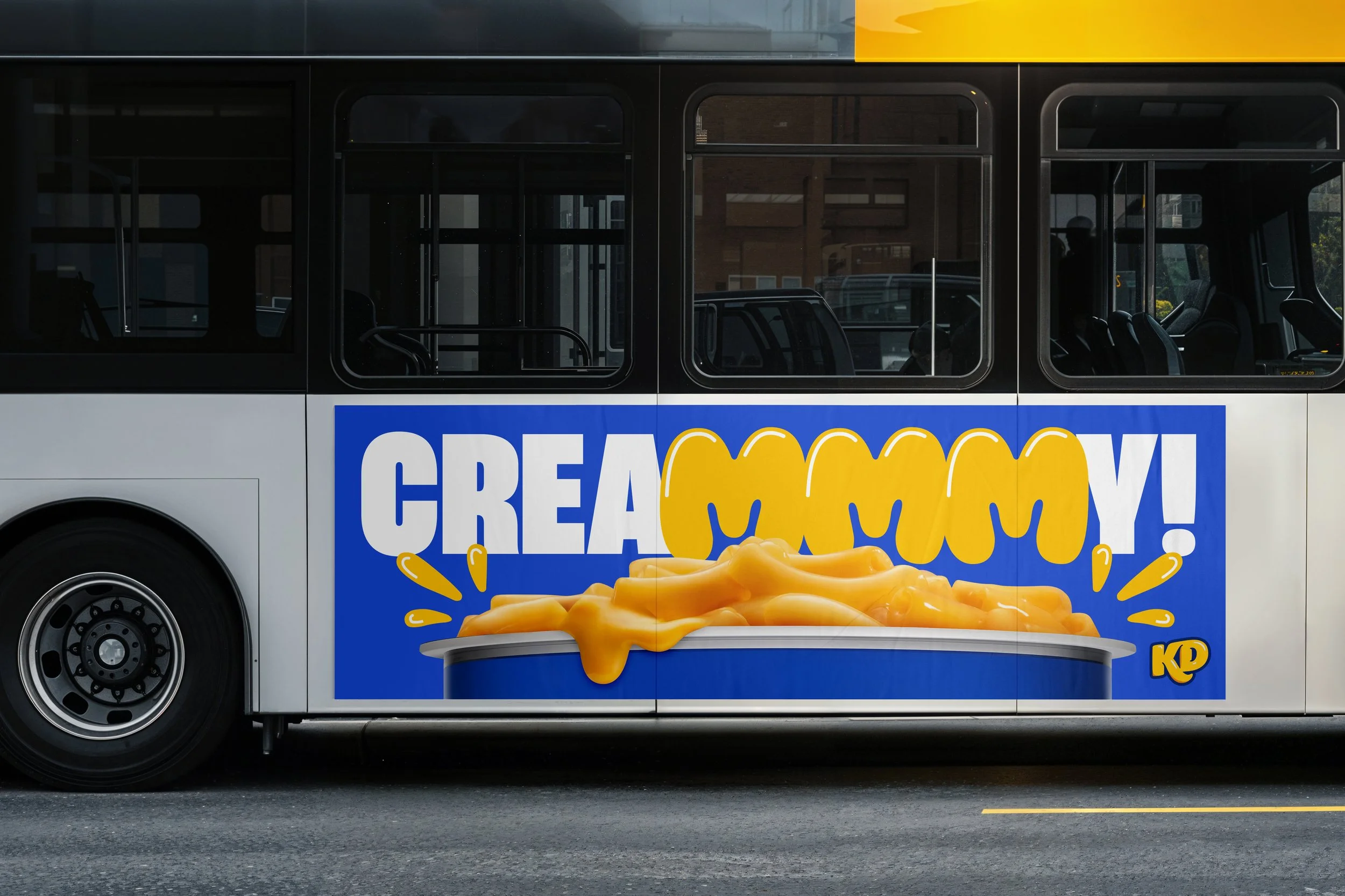
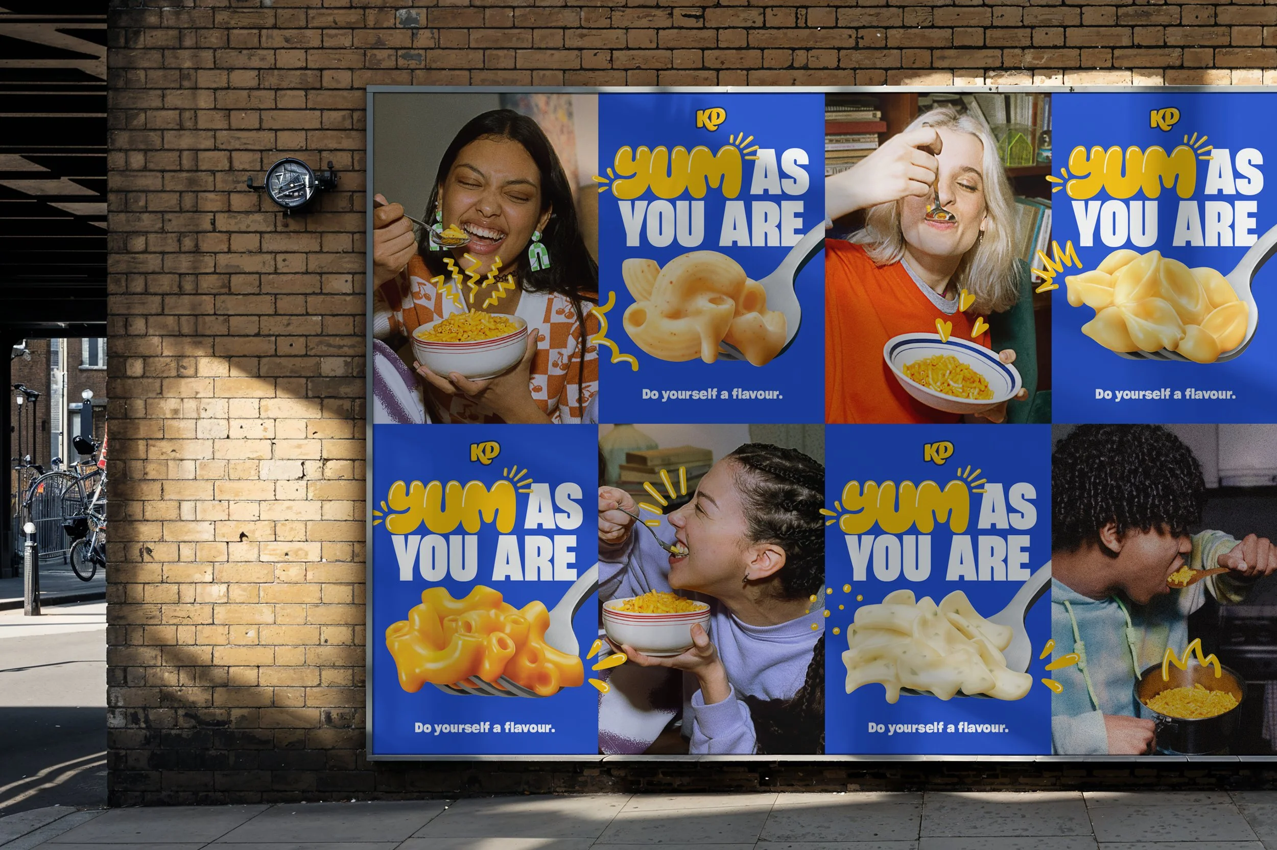
We expanded on our instantly recognizable blue and yellow box to give KD an entire brand refresh. We worked with OHNO Type Foundry, putting our cheesy flavour front and centre with a custom typeface that oozed craveability. We then channeled hand-drawn street art with a full set of doodles to add a level of personalization to each design. And finally topped it off with an authentic photography style that captures how people really enjoy KD in their everyday lives.
The result: a refreshed brand identity that didn’t just reignite older KD fans, but reasserted us as the cultural icon it’s always been for younger generations.
-
Made at Rethink
Executive Creative Direction: Hans Thiessen
Creative Direction/Design: Mark Mabey
Design: Thomas Hadfield
Motion Design: Jesse Shaw
Strategy: Jayne Stymiest
Accounts: Allie Kennedy, Jamie Faltl