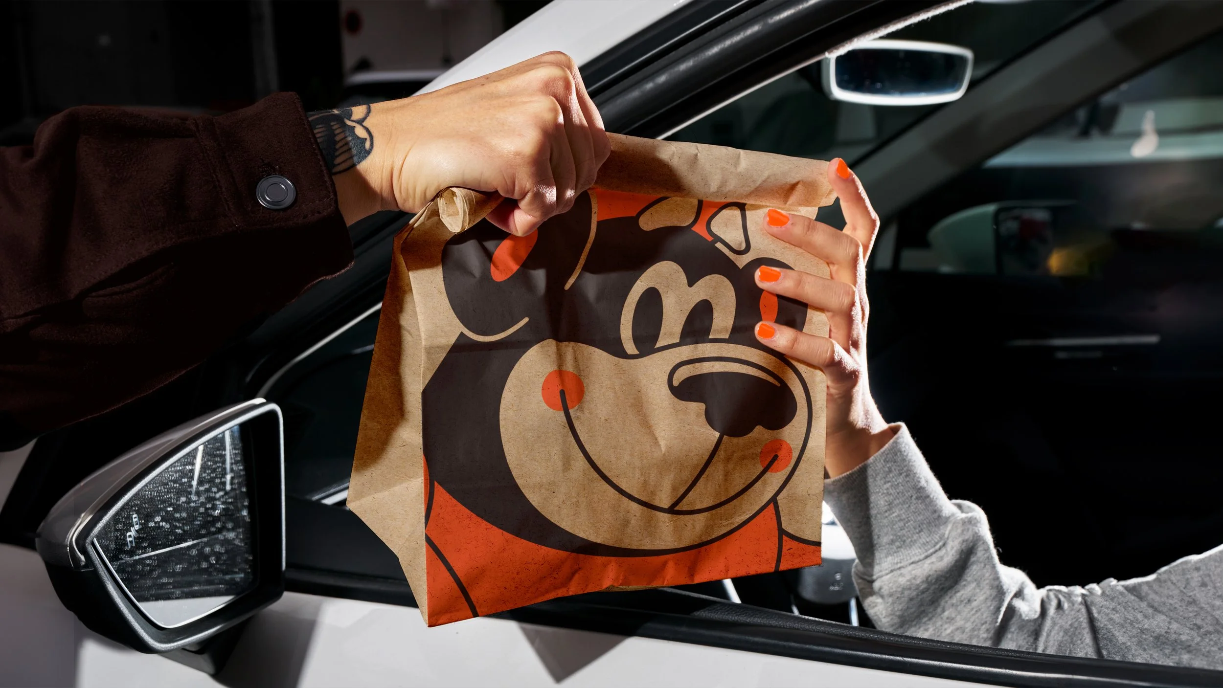
A&W Canada, 2024
Brand Identity
In 1956, A&W opened Canada’s first fast food restaurant and people instantly fell in love with their delicious burgers and iconic root beer. Since then, they’ve grown into Canada’s largest hamburger chain, with more than 1,000 franchises. But over time, A&W strayed from what initially defined them – building their entire brand around ‘natural ingredients’ and rational claims of quality – instead of why people fell in love with them in the first place: their irresistably delicious food.
The system consisted of a droolworthy colour palette that put A&W’s iconic orange back in the spotlight, a modular shape system inspired by their burgers and ingredients that would allow us to playfully communicate ingredient messaging, and a bespoke type family crafted for every craving. We re-imagined their brand mascots and harmonized the different illustration styles introduced over multiple eras of the brand under a single style, which we then used to redraw the Burger Family and Rooty the Root Bear. Finally, we turned up the dial on craveable food photography.
Ushering in a new generation of burger lovers and reminding Canadians why they fell in love with A&W in the first place.
-
Made at Rethink
Executive Creative Direction: Hans Thiessen
Creative Direction: Alex Bakker
Associate Creative Direction/Design: Mark Mabey, Justin Kowalczuk, Brie Lim
Motion Design: Jesse Shaw
Strategy: Sam Masooleh
Accounts: Ed Vaughan-Hughes, Tianna Fung